 Today we learned how to make book covers. First we had to measure our book so that we knew how large to make the image. My book came out to be 17.25 by 8 inches when not folded. The book I chose was the Inferno by Dante Aligheiri. The actual cover I printed and the one I have here are slightly different, I lost some of my data.
Tuesday, December 8, 2015
BOOK COVER design
 Today we learned how to make book covers. First we had to measure our book so that we knew how large to make the image. My book came out to be 17.25 by 8 inches when not folded. The book I chose was the Inferno by Dante Aligheiri. The actual cover I printed and the one I have here are slightly different, I lost some of my data.
TF booklet 8 page
Thursday, November 19, 2015
My Type Assignment
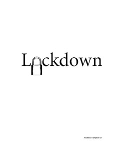
Once more we are working with Adobe InDesign. For the most part we where told to take words and replace letters with objects related to the word or phrase. This first one however was to take a letter fill in its 'hole' and make a new one with another object turned white.
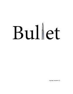
The next three images where made by replacing letters and words with images. The first one was just an image that related to the word, the second was an image of the word its self, the third an entire word with an image that fit in the sentence.
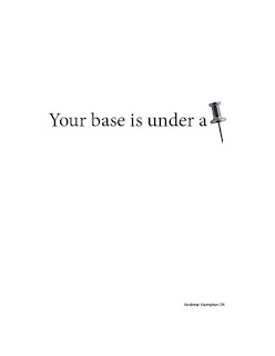
This next image designed to replicate the word with the word its self.

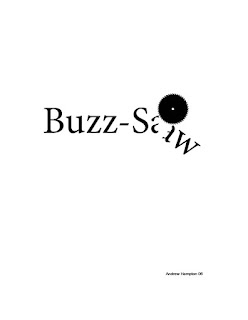
This next one was designed to make an object that interacts with its word.
This last one was designed to make a word out of at least two images. I went with movie star.
The next three images where made by replacing letters and words with images. The first one was just an image that related to the word, the second was an image of the word its self, the third an entire word with an image that fit in the sentence.


This next image designed to replicate the word with the word its self.

This next one was designed to make an object that interacts with its word.

This last one was designed to make a word out of at least two images. I went with movie star.
Type Figures usining Adobe InDesgin
Recently we have been learning how to use Adobe InDesign. And for the most part it has been an interesting experience. This first image however wasn't made in InDesign, it was made in Adobe Photoshop. I took the select tool and slightly shifted sections to make it look like the work was shaking.
The rest of the images where made with InDesign. This one was made taking letters and arranging them in the shape of a cow.
This next image was made forcing the text to follow a line drawn with the pen tool in InDesign.
This image was made by drawing an image then forcing the text to wrap around the image. I was in a Fallout mood.
This image was made by taking an emoji turning it and placing it in the sentence after I made a space for it.
 |
| Quake |
The rest of the images where made with InDesign. This one was made taking letters and arranging them in the shape of a cow.
 |
| Moo |
This next image was made forcing the text to follow a line drawn with the pen tool in InDesign.
 |
| Going up |
This image was made by drawing an image then forcing the text to wrap around the image. I was in a Fallout mood.
 |
| Ron Pearlman |
This image was made by taking an emoji turning it and placing it in the sentence after I made a space for it.
Tuesday, November 10, 2015
Selecting Text in Adobe InDesign
Ok so I let my dislike for adobe get to me a little. But this assignment is about how different clicks can can effect the selection of text. The number of clicks will change how much it selects and when you drag it selects more text based on how many clicks you used.
One click will place the select curser and then the one click drag will select more text on a single letter base. Two clicks will select on a whole word bases, three will select on a line bases, four will select on a paragraph bases and 5 selects everything.
One click will place the select curser and then the one click drag will select more text on a single letter base. Two clicks will select on a whole word bases, three will select on a line bases, four will select on a paragraph bases and 5 selects everything.
Tuesday, November 3, 2015
Logo Design and Layout Stages
So I was asked to make a personal Logo for myself. It had some stipulations and because it was for me and for grading the Logo had two audiences, My teacher and myself.
so the Logo is supposed to incorporate the principals of Gestalt, at least two initials, and be shapes rather then lines. Now I'm not going to lie I am very bad at thinking in Gestalt but I did finally wrap my head around it and make something good. I started with making several thumbnails, narrowed it down to two turning them into rough drafts, then I selected one and made it a final version.
So in two sentences: Use the elements of design and Gestalt to make a personal Logo that incorporates a part of yourself and three of your initials. Show all the steps.
Bottom line: Make Logo that follows all the steps of design and incorporate Gestalt.
 |
| Thumbnails |
 |
| Roughs |
Thursday, October 15, 2015
Low Quality Raster LOGO Reconstruction in Vector Format.
Preperation
to prepare for this assignment we where handed a handout with the instructions to write our name in the bottom right hand corner of the image, then scan the image. We scanned using the greyscale color mode at 600 pixels per inch. We scanned at these parameters because it would yield the 'Best' scan for this image. You can always remove pixels but adding pixels doesn't help.
Clean Up in Photoshop
In photo shop I used the Levels option to adjust the light and dark levels to remove most of the static in the image due to the original image being very poor quality.
Live trace in Illustrator
Live trace can be a very useful tool but when your image is bad you get a bad live traced image. I could have spent a few hours fixing this image with the remove anchor tool and direct select tool, which means the live trace tool was not the tool for this instance.
Logo Reconstruction Using the PEN Tool in Illustrator
So for speed and efficiency I used the Pen tool to redraw the Logo. I used the skills learned in a previous assignment about the Pen tool, which I have made a full tutorial for here {Link} with a new trick I learned today.
In the end I came out with this image as my final product in a fraction of the time it would have take to get the same result with he Live Trace tool.
File Formats
Both images use very small color pallets so I went with the Gif format to make as small a file as possible for delivery. During working on the images I used the working file formats as normal (PSD, AI, Tiff) so that I didn't cause more damage to my images then what was already there.
Advice on Vector Creation
If the image is very complex good quality images use Live trace for poor quality images it might just be easier to recreate it all together. Use your best judgement.
Tuesday, October 13, 2015
High Quality RGB Converted to Vector
 | |
| Unmodified Trace |
 | |
| RGB upped resolution trace |
Raster RGB and Indexed increased Resolution Quality Comparison.
So in this I took the Sony Ericson logo and boosted the resolution up to 1000 pixels on the Width line. But one of hem i made a slight tweak, I changed it from Indexed color to RGB before I upped the resolution. And the difference is there, the RGB logo came out smoother and higher quality because the computer had more colors in its palette to play with.
 |
| Indexed Color |
 |
| RGB |
Vector File Size Comparison
Anchor points are the mathematical points in which a computer uses to play connect the dots and draw an image. The more anchor points the more complex the image and the greater the file size. I took one of my selfies and made one a High Fidelity image, a 3 color image and an Abstract Reconstruction image.
The High Fidelity image came out to have the most Anchor points and because of this it had the largest file size coming in at 11mb. The next largest image was the three color seeing as it had considerably less Anchor points the the High Fidelity and more then the Abstract image, it weighed in at 2.1mb. And the Abstract image came in with the smallest file size of 1.6mb and only two anchor points.
The High Fidelity image came out to have the most Anchor points and because of this it had the largest file size coming in at 11mb. The next largest image was the three color seeing as it had considerably less Anchor points the the High Fidelity and more then the Abstract image, it weighed in at 2.1mb. And the Abstract image came in with the smallest file size of 1.6mb and only two anchor points.
Thursday, October 8, 2015
Raster to Vector to Raster
There are many options under the Trace Image option to make your Raster Images into Vector Images in Illustrator but I chose the Over Kill method for all of them. I could have traced them in lower levels of color such as 2, 8, 16, 32 color images or indexed color but I chose the High Fidelity color image trace for all three just to make sure.
The Sony Icon at the bottom required an extra step before I traced it. When ever I traced it using Illustrator it came out splotchy and bad looking. So I had to open it in Photoshop and raise the Image resolution to 300 pixels per inch. I then opened it in Illustrator and traced it and it came out much better.

I then had to make delivery images for my blog. I use the Save For Web option and chose to save the Bat man logo as a gif with 123 colors left in the image to make it as small as possible. But because the other images have much more colors then the batman logo I saved them as Jpgs.
And that's how I went from raster image to vector image to raster image again.
The Sony Icon at the bottom required an extra step before I traced it. When ever I traced it using Illustrator it came out splotchy and bad looking. So I had to open it in Photoshop and raise the Image resolution to 300 pixels per inch. I then opened it in Illustrator and traced it and it came out much better.

I then had to make delivery images for my blog. I use the Save For Web option and chose to save the Bat man logo as a gif with 123 colors left in the image to make it as small as possible. But because the other images have much more colors then the batman logo I saved them as Jpgs.
And that's how I went from raster image to vector image to raster image again.
Tuesday, October 6, 2015
Thursday, October 1, 2015
Raster to Vector
Vector images, are images 'drawn' by math. Every color has a mathematical color assigned to it and a mathematical position as well. Because Vectors are math based you have more freedom of movement. By using many of the tools you can tweak a part of the image and it will adjust the rest of the image according to the change in the mathematical data.
Raster Images are drawn with Pixels and nothing else. To change anything in a Raster image you have to do it yourself rather then letting the computer adjust the image based on your tweaks.

It is possible to convert a Raster image into a Vector image but it won't be one hundred percent right, but it will be extremely close. The image on the left was just a normal Raster image and the one on the right was a Vector image.
How I converted it to a Vector, I opened the image on the left in Illustrator. Then used the Image trace option. This identifies the colors and makes a recreation of the image as a mathematical image. I traced the image as a 6 color image which traced the image and brought the number of colors from 16.7 million to 6, but you can make a traced image in the full colors. I then changed the hue of the image to be more blue then brown.
By selecting the Expand option next to the Trace Image option it shows the mathematical anchors for each section of color. And now that it is a Vector image you can adjust the anchors of the image and change it.
Clone Tool
The Clone Tool
The clone tool works by making an initial selection of what you want to copy then brushing over the area you want to place the copy. Be warned that the area you selected first as the clone target will move as you brush the location area.
Liquify Filter
Lets talk filters, the liquify filter to be more precise. The liquify filter can do a lot to an image and make some neat effects. There are three tools your gonna want to know about within the filter to get these neat effects.
The Forward Warp Tool
The forward warp tool is used to push colors around and make it look like you smudged the image.
The Pucker Tool
This tool sucks the color of the image inward to the center of the tool. This makes the area effected look smaller.
The Bloat Tool
This tool is the opposite of the Pucker tool. This tool pulls the color towards the outside of the tools area of effect to make something look larger then normal.
Tuesday, September 29, 2015
Gif Colors and Quality
Gifs are an indexed color file format. By being indexed color it means they only go up to 256 colors which is far from the 16.7 million colors of RGB.
But because you have so few colors it brings the size of the image down a great deal. Even within these two indexed color Gif images to the left the sizes are different.
The Bottom one has 200 different colors while the top only has 6. This means the top image has a much smaller size, with the top image being 8kb and the bottom one being 30kb.
Thursday, September 24, 2015
JPG Compression and File Size
JPGs are a semi useful file type. When you save an image as a JGP you reduce the quality of the image which is bayd, but you get a much smaller file which is good for delivery to the internet or another person. Ideally we wouldn't want to do this but it's a necessary evil. You also have the option when you ask Photoshop to save for the Web to reduce the quality even further then it normally would. The images up top from left to right have their quality set at 0%, 60% and 100% detail preserved. Again we wouldn't normally want to do this but when you have to make an image that can be accessed by every one (including people still using computers from the 1990s) you have to sometimes make sacrifices.
Tuesday, September 15, 2015
Compositing
This image was made using several other images which where modified in Photoshop. Each image had undesirable aspects for this image removed from it, mainly the backgrounds.
The modifications where made using several selection tools but most predominantly the Magic Wand Tool. The Magic Wand Tool selects in a nice large area and makes precise selections at the same time very quickly. For the mistakes I use the Lasso Tool to make corrections. Holding shift let me add selections missed by the Magic Wand Tool and Holding Option let me remove selections that shouldn't have been made. I the copied and pasted the desired section of the images I harvested into a new image with each new addition to the image getting its own 'layer'. The layers act like an image in real life would. When you cut an image up in real life and layer them the images underneath are visible through the negative space and its the same with the Photoshop layers. After resizing and placing the images where I wanted them I saved my new image and posted it here, hope you enjoy it.
Wednesday, September 9, 2015
Selection Tools
The Elliptical Marquee Tool
This tool is used to make selections in an elliptical area.

The Rectangular Marquee tool
This tool is use to make selections in a rectangular area
The Lasso Tool
This will make a selection in an area drawn by the mouse.
The Magic Wand Tool
This tool will make a selection based on the difference in the colors of pixels in an area.
The Polygonal Lasso Tool
This tool will make a selection in an area drawn with the points
This will make a selection in an area drawn by the mouse based on the color diferance of the pixels being run over by the mouse.

Subscribe to:
Comments (Atom)


