 Today we learned how to make book covers. First we had to measure our book so that we knew how large to make the image. My book came out to be 17.25 by 8 inches when not folded. The book I chose was the Inferno by Dante Aligheiri. The actual cover I printed and the one I have here are slightly different, I lost some of my data.
Andrew's GRA 101 Blog
Tuesday, December 8, 2015
BOOK COVER design
 Today we learned how to make book covers. First we had to measure our book so that we knew how large to make the image. My book came out to be 17.25 by 8 inches when not folded. The book I chose was the Inferno by Dante Aligheiri. The actual cover I printed and the one I have here are slightly different, I lost some of my data.
TF booklet 8 page
Thursday, November 19, 2015
My Type Assignment
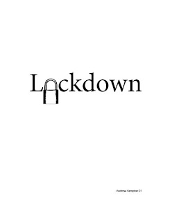
Once more we are working with Adobe InDesign. For the most part we where told to take words and replace letters with objects related to the word or phrase. This first one however was to take a letter fill in its 'hole' and make a new one with another object turned white.
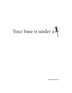
The next three images where made by replacing letters and words with images. The first one was just an image that related to the word, the second was an image of the word its self, the third an entire word with an image that fit in the sentence.
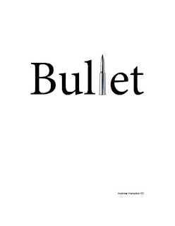
This next image designed to replicate the word with the word its self.

This next one was designed to make an object that interacts with its word.
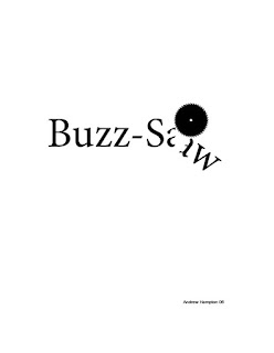
This last one was designed to make a word out of at least two images. I went with movie star.
The next three images where made by replacing letters and words with images. The first one was just an image that related to the word, the second was an image of the word its self, the third an entire word with an image that fit in the sentence.


This next image designed to replicate the word with the word its self.

This next one was designed to make an object that interacts with its word.

This last one was designed to make a word out of at least two images. I went with movie star.
Type Figures usining Adobe InDesgin
Recently we have been learning how to use Adobe InDesign. And for the most part it has been an interesting experience. This first image however wasn't made in InDesign, it was made in Adobe Photoshop. I took the select tool and slightly shifted sections to make it look like the work was shaking.
The rest of the images where made with InDesign. This one was made taking letters and arranging them in the shape of a cow.
This next image was made forcing the text to follow a line drawn with the pen tool in InDesign.
This image was made by drawing an image then forcing the text to wrap around the image. I was in a Fallout mood.
This image was made by taking an emoji turning it and placing it in the sentence after I made a space for it.
 |
| Quake |
The rest of the images where made with InDesign. This one was made taking letters and arranging them in the shape of a cow.
 |
| Moo |
This next image was made forcing the text to follow a line drawn with the pen tool in InDesign.
 |
| Going up |
This image was made by drawing an image then forcing the text to wrap around the image. I was in a Fallout mood.
 |
| Ron Pearlman |
This image was made by taking an emoji turning it and placing it in the sentence after I made a space for it.
Tuesday, November 10, 2015
Selecting Text in Adobe InDesign
Ok so I let my dislike for adobe get to me a little. But this assignment is about how different clicks can can effect the selection of text. The number of clicks will change how much it selects and when you drag it selects more text based on how many clicks you used.
One click will place the select curser and then the one click drag will select more text on a single letter base. Two clicks will select on a whole word bases, three will select on a line bases, four will select on a paragraph bases and 5 selects everything.
One click will place the select curser and then the one click drag will select more text on a single letter base. Two clicks will select on a whole word bases, three will select on a line bases, four will select on a paragraph bases and 5 selects everything.
Tuesday, November 3, 2015
Logo Design and Layout Stages
So I was asked to make a personal Logo for myself. It had some stipulations and because it was for me and for grading the Logo had two audiences, My teacher and myself.
so the Logo is supposed to incorporate the principals of Gestalt, at least two initials, and be shapes rather then lines. Now I'm not going to lie I am very bad at thinking in Gestalt but I did finally wrap my head around it and make something good. I started with making several thumbnails, narrowed it down to two turning them into rough drafts, then I selected one and made it a final version.
So in two sentences: Use the elements of design and Gestalt to make a personal Logo that incorporates a part of yourself and three of your initials. Show all the steps.
Bottom line: Make Logo that follows all the steps of design and incorporate Gestalt.
 |
| Thumbnails |
 |
| Roughs |
Thursday, October 15, 2015
Low Quality Raster LOGO Reconstruction in Vector Format.
Preperation
to prepare for this assignment we where handed a handout with the instructions to write our name in the bottom right hand corner of the image, then scan the image. We scanned using the greyscale color mode at 600 pixels per inch. We scanned at these parameters because it would yield the 'Best' scan for this image. You can always remove pixels but adding pixels doesn't help.
Clean Up in Photoshop
In photo shop I used the Levels option to adjust the light and dark levels to remove most of the static in the image due to the original image being very poor quality.
Live trace in Illustrator
Live trace can be a very useful tool but when your image is bad you get a bad live traced image. I could have spent a few hours fixing this image with the remove anchor tool and direct select tool, which means the live trace tool was not the tool for this instance.
Logo Reconstruction Using the PEN Tool in Illustrator
So for speed and efficiency I used the Pen tool to redraw the Logo. I used the skills learned in a previous assignment about the Pen tool, which I have made a full tutorial for here {Link} with a new trick I learned today.
In the end I came out with this image as my final product in a fraction of the time it would have take to get the same result with he Live Trace tool.
File Formats
Both images use very small color pallets so I went with the Gif format to make as small a file as possible for delivery. During working on the images I used the working file formats as normal (PSD, AI, Tiff) so that I didn't cause more damage to my images then what was already there.
Advice on Vector Creation
If the image is very complex good quality images use Live trace for poor quality images it might just be easier to recreate it all together. Use your best judgement.
Subscribe to:
Posts (Atom)


